1 March 2022
Billie Justice Thomson
Billie Justice Thomson’s work has caught the imagination of Australians all over the country, painting nostalgic and iconic food imagery on glass or Perspex, referencing the old shop windows of yesteryear.
Billie Justice Thomson’s work has caught the imagination of Australians all over the country, painting nostalgic and iconic food imagery on glass or Perspex, referencing the old shop windows of yesteryear.
Billie's artwork resonates with people who celebrate the same things we do. Whether it’s a Negroni, a bottle of French Champagne, or a rainbow Paddle Pop, the subject matter speaks about the flavours of fun.
We saw her work popping up all around town, slapped up on street signs, at the Central Markets, but mostly in magnet form on our mate’s' fridges.
It was such an awesome way to support a local artist, her style is incredibly accessible and speaks to so many Australians about the brands, and products that they love.
for Father’s Day I bought my husband a bottle of Never Never. It was just after they had won the big prize, I actually felt really proud of the guys.
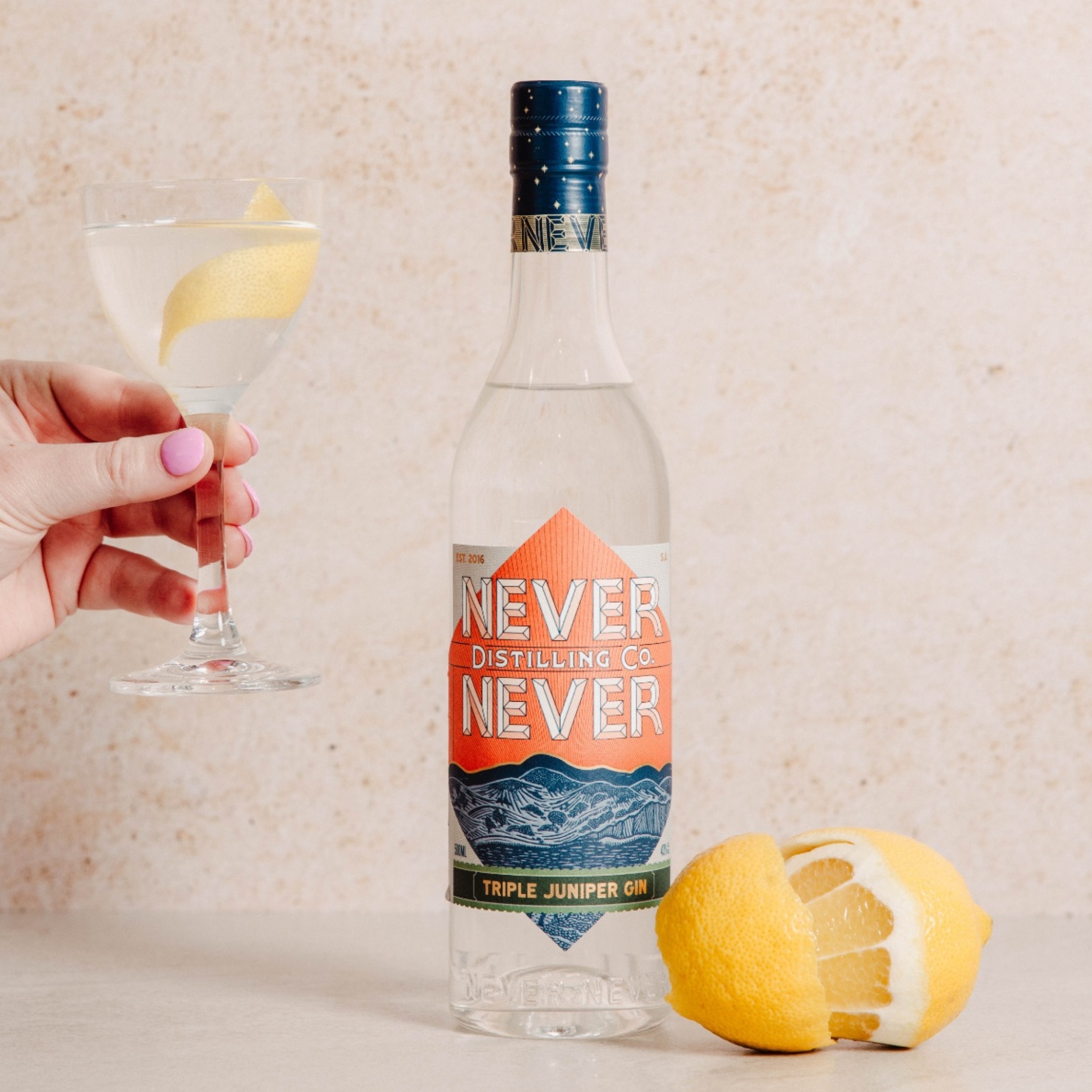
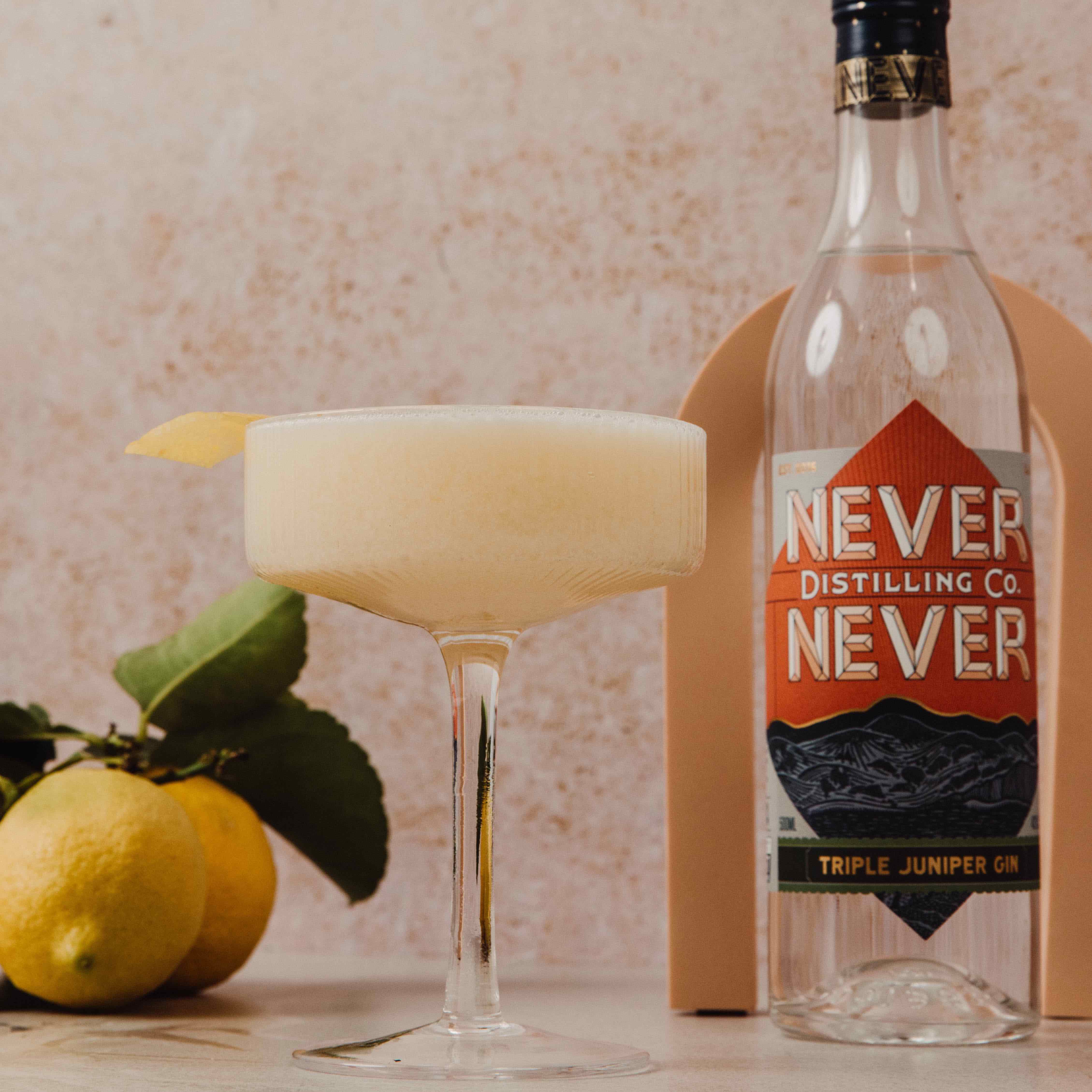
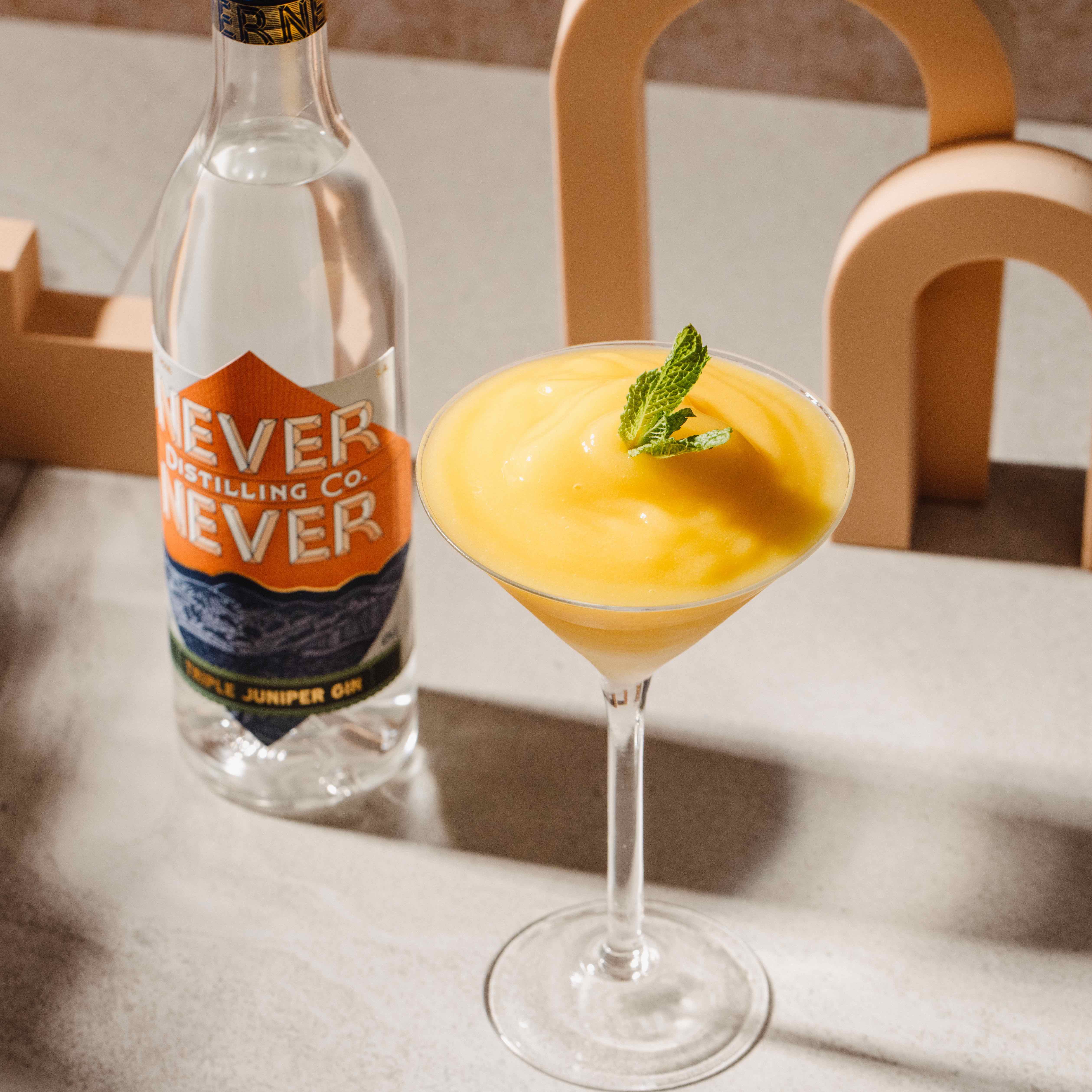
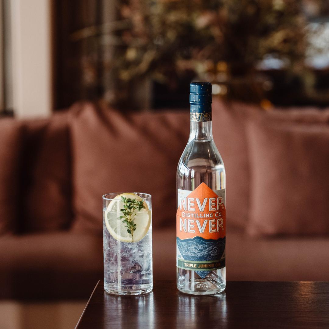
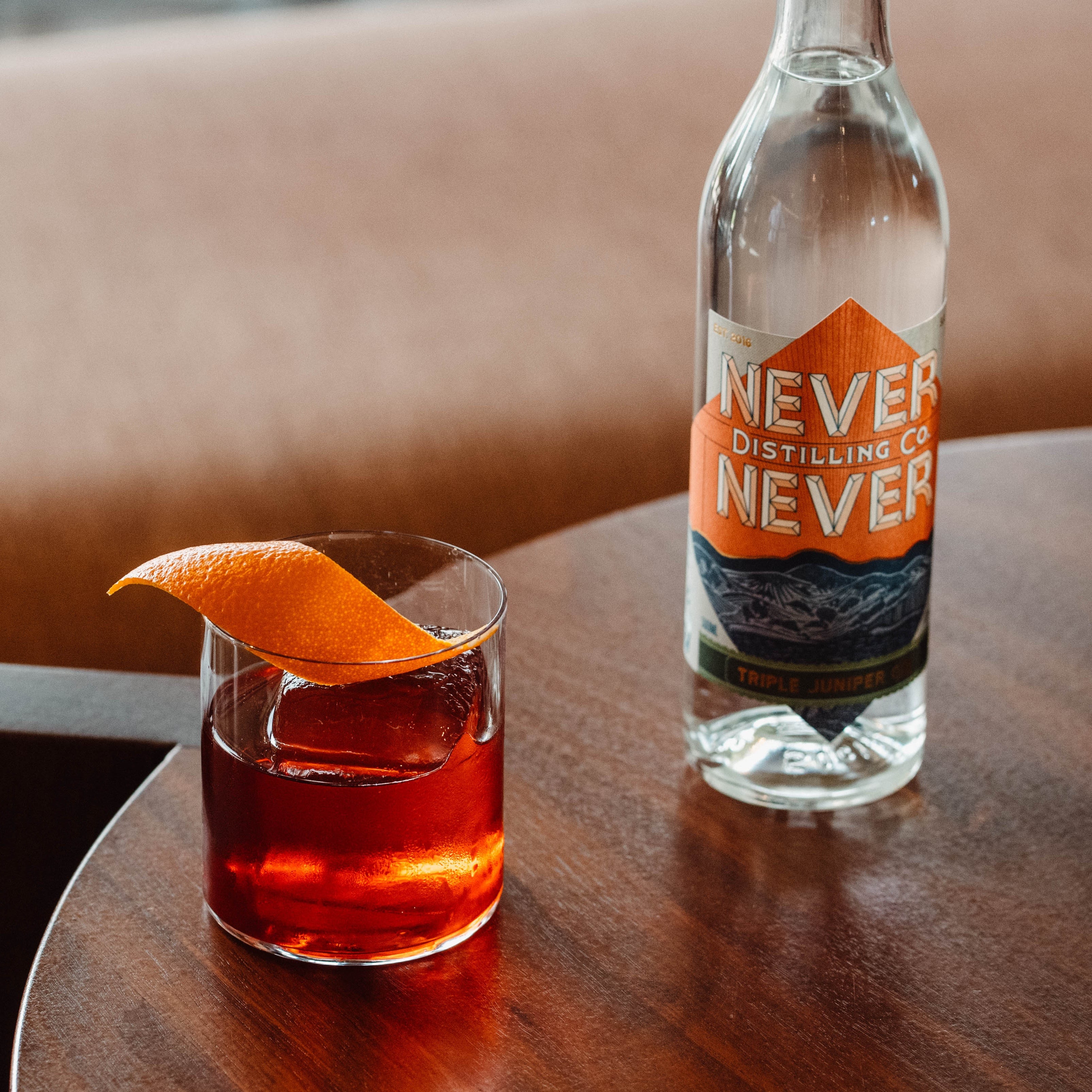
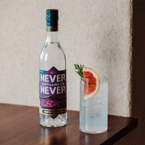
Our Triple Juniper Label was created by local designer Carlo Jensen from Peculiar Familia, with local artist Kerri Wright commissioned to create the lino. It’s a representation of our desire from the very outset to work with genuinely creative people to create a contemporary spirits label.
It’s not the first time the label has caught the attention of the judges. The label design won the Easy on the Eye category at the 2019 Drinks Easy Awards, one of Australia’s newest and most exciting drinks competitions.
The Easy on the Eye Awards formally recognize the absolute best in consumer product packaging design Australia-wide, bringing awareness to the immense value that lies in well-designed brand packaging.
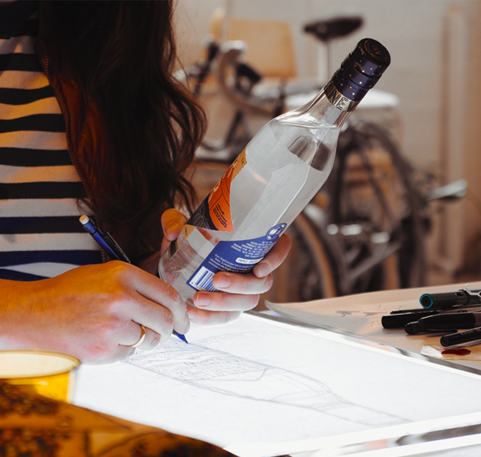
One of the most exciting components of the collaboration was a short film that was shot in order to introduce Billie to a wider Australian and global audience and to showcase how the collaboration transpired.
Billie is an amazing talent, whose story is incredible. As soon as we stepped into her studio, we knew we wanted to capture the passion that makes her so bloody incredible
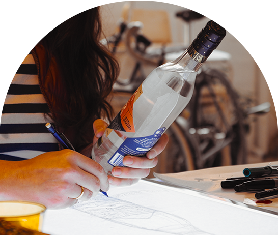
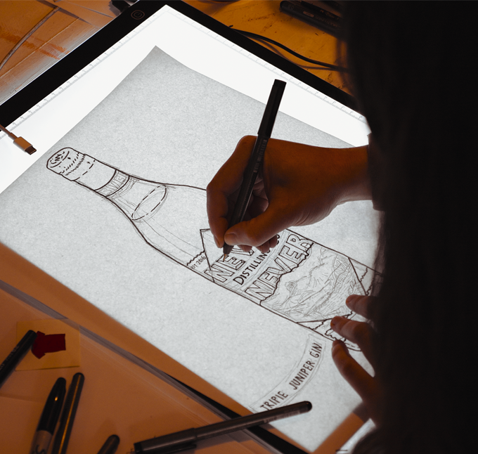
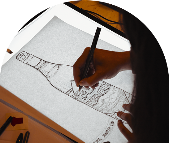
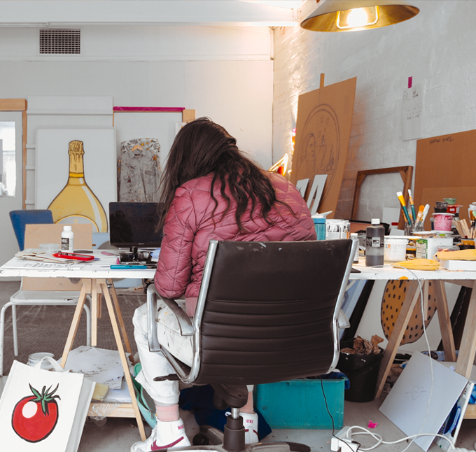
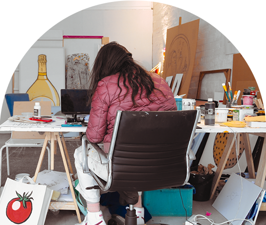
We can only dream that one day our brand might be as famous as some of the other icons she’s painted. Right now we’re happy to just be an Aussie brand to watch. Even if it’s from across the kitchen table at breakfast when you’re desperately trying not to think about knock-off drinks.
“It was lovely to draw my mate Carlo’s design and the beautiful linocut of the hills was so lovely. The colours and line work were a pleasure to work with.”
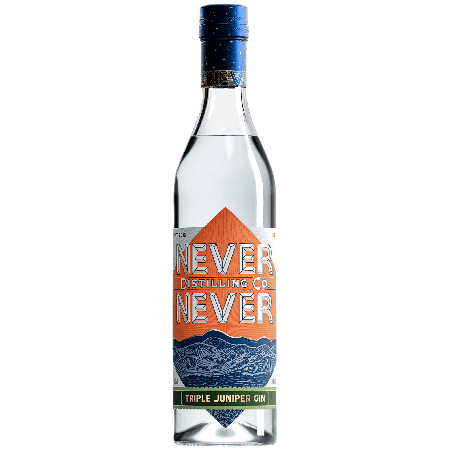
Our signature Triple Juniper Gin combines three different distillation processes, each uncovering the bright and earthy qualities of juniper.


